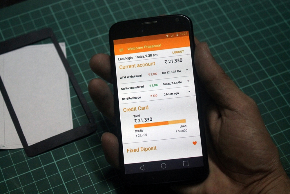
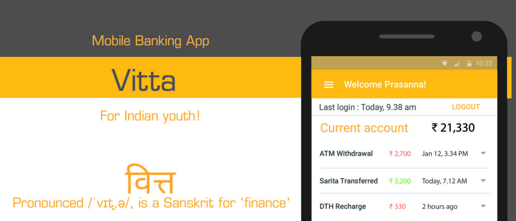
Vitta - Mobile banking app
Vitta is an banking app for running on low RAM mobile phones targetted towards young investors.
Market research
Market research shows that:
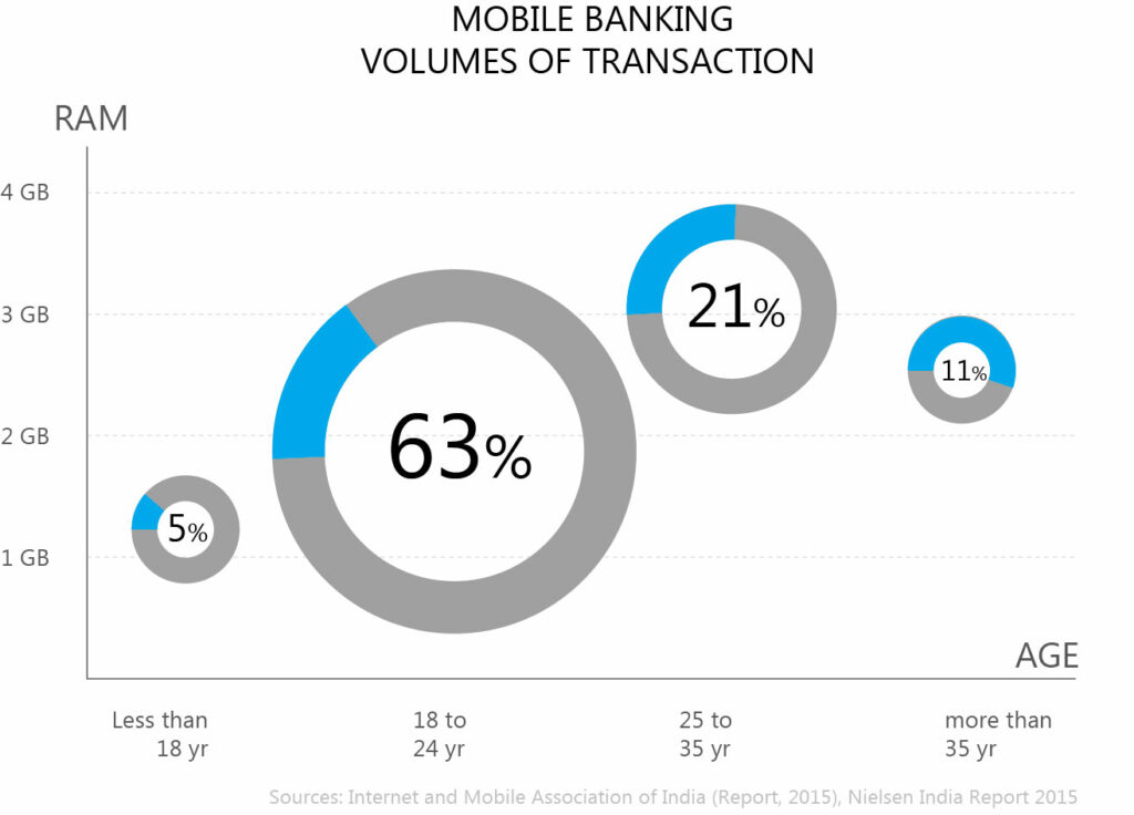
- A large number (63%) of users between age group 18 to 24 years use mobile phone for banking.
- Majority of these users have smartphones which have have RAM between 1 to 2 GB.
- These users use mobile banking app on quite frequent basis, though the amount transacted each time is less.
Source : The Internet and Mobile Association of India (IAMAI), Mobile internet usage report, 2015
User categories
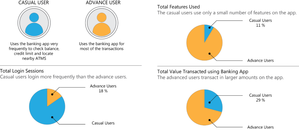
- Casual Users use only limited features of the banking app.
- Though, the Casual Users make the highest use of the banking app.
- The amount transacted per session by casual users is quite low.
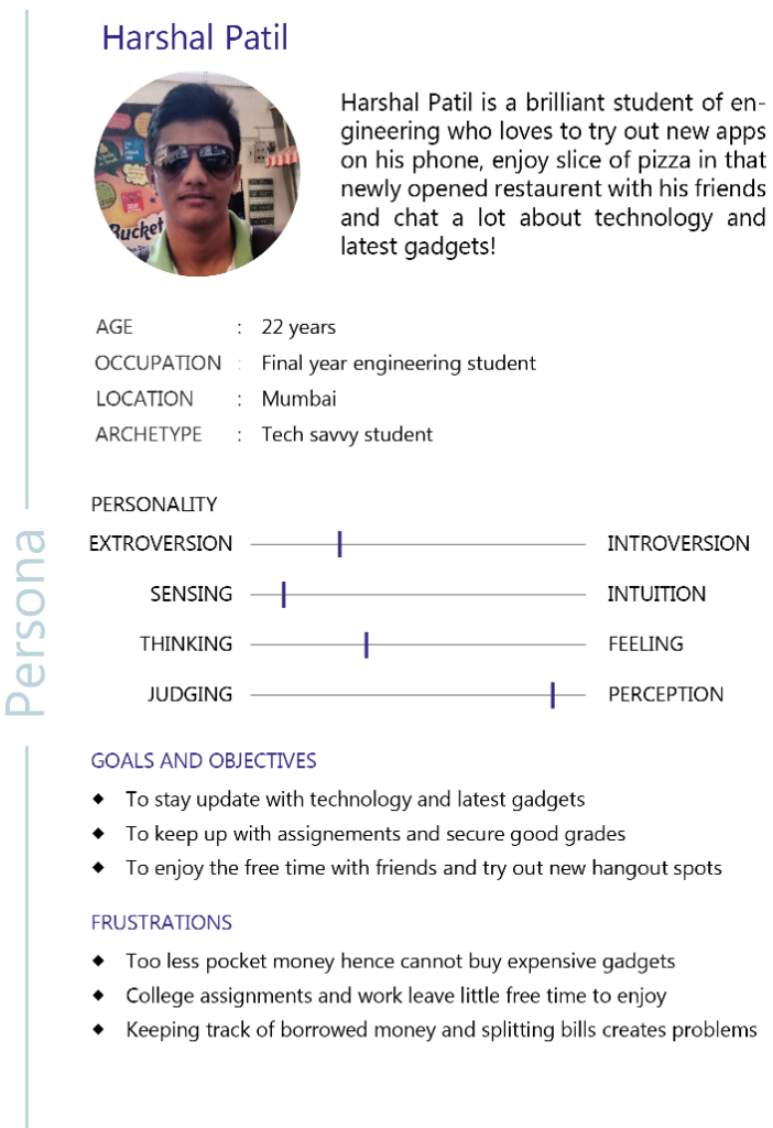
Persona
The persona represents a typical casual user of the mobile banking app
- The user has recently started earning, and is quite keen to explore the world on mobile banking.
- He is quite used to a smart phone, however, does not have enough income to invest in a high-end phone.
- His typical use of the mobile banking app is:
- Check how much saving is available on his bank account
- Seeing his credit limit, so that he can make a decision regarding purchases.
- Locate ATMs where he can withdraw money for purchasing goods.
Mood board

Colors set the mood. Moodboard was used to decide the colors. It was created using a montage of the images which represent the mood of the context of use.
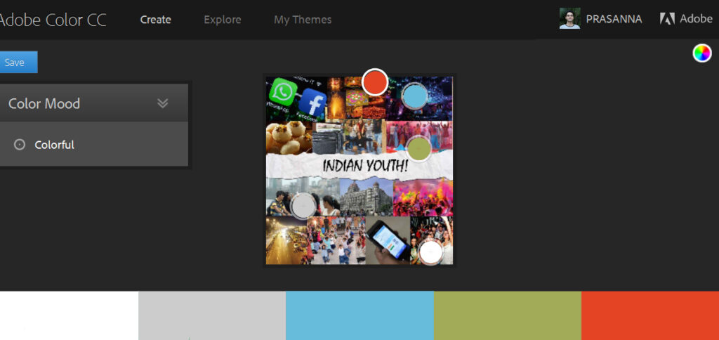
Adobe Color was used to figure out the color combination of the mood-board.
Card Sorting
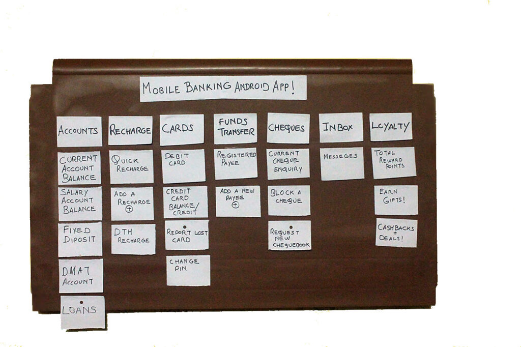
A quick card-sorting exercise was run with the users to uncover their mental model. Here we can see the resulting sorting with it’s heads.
This helped me decide which features would appear on the home screen of the mobile banking app and which could be left a tap or two away.
Wireframing
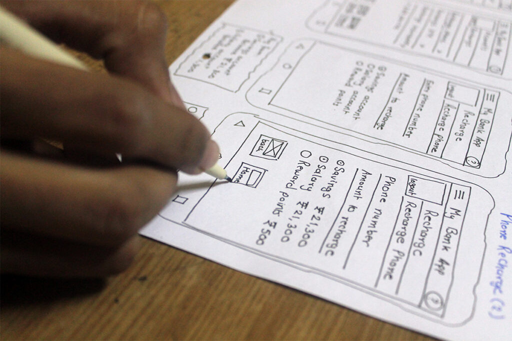
A lots of ideas were generated and quickly sketched out. From these some ideas were picked up for final designs.
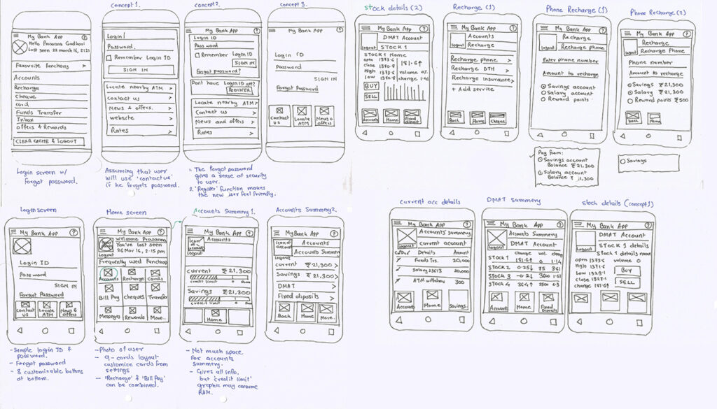
Some of the wireframes and scenarios are shown here.
RAM Consumption
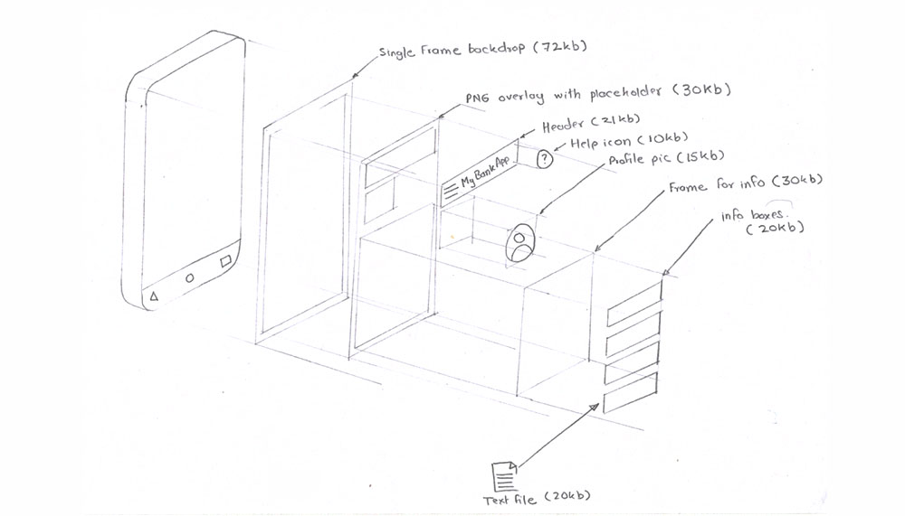
This app is designed for low RAM mobile phones. Hence it is essential to know how much RAM does it consume.
By discussing with app developers, I was able to get an estimate how much memory this app takes to run.
By keeping the number of images, icons and animations to minimum, the RAM consumption was kept low.
Anatomy and Features
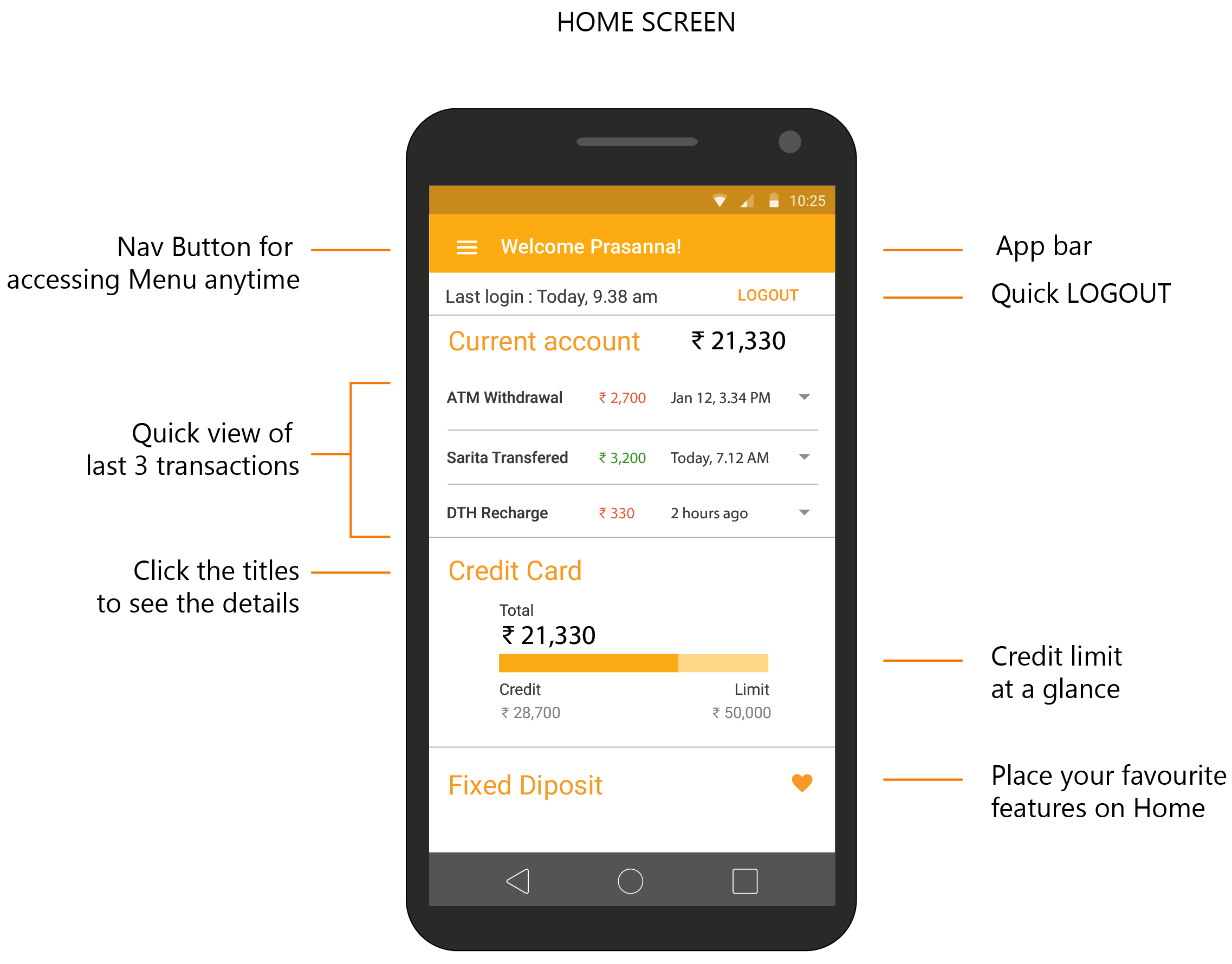
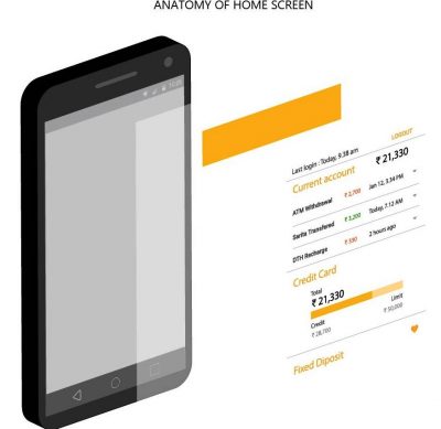
This app is targeted towards the Casual Users. Hence on the Home Screen.
- Navigation: This is the standard navigation based on Android OS.
- Last login: This gives a basic level of security.
- Quick logout is provided because many of the users feel that they need to logout frequently for safety.
- Last 3 transactions gives user an idea about how they are spending. It also helps them see other similar transactions on the drop-down.
- Credit limit is shown as a progress bar to give user an idea of how much credit they have left. This limit may change based on user’s spending habits.
- Custom features allow the users to place some of their most frequently used features on the home screen.
Visual Designs
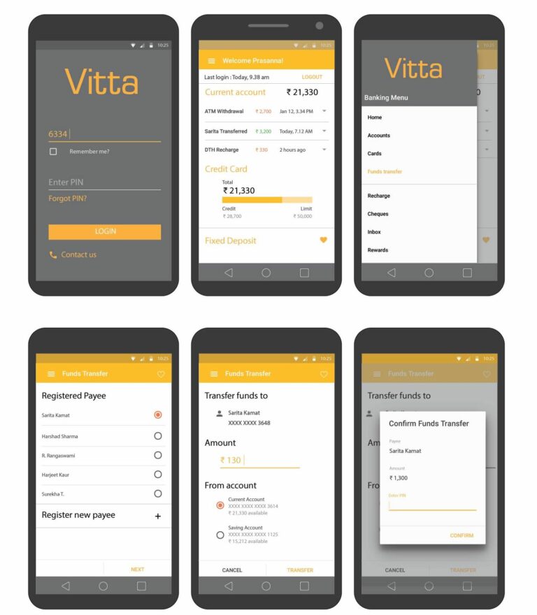
Interactive prototype - Click on the mobile below to interact!
Conclusion and Future scope
This app was primarily designed for study project, however this project allowed me to hone and showcase my skills during a number of different places.
Future scope:
There is a lot going in finance technology these days. However, not all mobile-friendly technologies cater for low-end phone users. Several banking apps even have finger-print recognition technology (despite the limitations), though these kind of sensors are not present in lower end smart phones. Therefore, there is lots to be explored in this area.
