How I helped Cisco sell $500 million switches…

Cisco is a leader in ethernet switches and routers. They took a bad hit in 2017. Their sales hit all time low and they needed to change their game. 

In these desperate time, I was the product designer in a team that designed a switch selector which increased the sales. This was the first time that you can buy the switches just like buying a new dress! 

This boosted the sales of switches by $500 million.

You can see this switch selector here!


Note: Because of the non-disclosure agreement, some of the information on this page has been replaced with fictitious ones or has been blurred out


The dire situation!

What was the business situation to create this?


Cisco Systems CEO Chuck Robbins explains the poor sales on CNBC.

Source: Full video (c) CNBC

Market conditions:
Cisco is a leader in networking equipment. Every 2 out of 3 network hardware is made by Cisco according to SmartProfile Analytics

However in 2017, their sales hit an all-time low. This was a time when everyone at Cisco were very tense as it could mean that their legacy could end!

In these times, they decided to investigate all possible means to increase their sales!

We must improve the sales of Ethernet switches!

Source: Infotech Lead.

Ethernet switches are significant!

Sales of switching equipment (also known as ethernet switches) contribute to about a third of total revenue of Cisco.

Any improvement in sales of switches would improve the overall revenue. Therefore we decided to investigate into ways to improve the sales of switches.


Getting to know the users

Finding out what exactly caused this problem.

As a product designer in the team, I wanted to know who were the buyers of the switches. The marketing team connected me with some of the past customers and some potential ones. After interviewing about 15 of them, I was able to derive some insights into the problem they faced.

Challenges: Marketing team did not agree with my approach
The marketing team felt that they already had all the data from the market research they had conducted. However I politely disagreed with them because:
1.   They had a broad overview and not a deep insights
2.  Their researched into
what people buy rather than how they buy!

Solution: Creating a user journey map
I chose to create a user-journey map in order to understand and document the current process of ordering a switch. Using this I saw the mental states of the user at each point. This gave me clarity on where the problems were.

The existing design of the page did not consider usability. It was not DIY friendly. It expected the users to get in touch with sales team.

Current user-journey map to identify the pain points


 Top-most pain-points

Listing down my learnings from the user-journey map.

Data-sheets suck!

Users ask, “Will this switch work for me?” and the data-sheets don’t answer that. Talking with the help centre is time-consuming and inconvenient.

I cant compare!

There was no tool available for comparing the important points which would help them make buying decision.

I just want to upgrade

Finding an upgrade to ethernet switch was painful process. Comparing jargon-filled data-sheets was the only means.


 Why users hated the data-sheets?

Hint: They can’t find what they are looking for in there

Buyers can’t use the data-sheets to make buying decisions because of too much irrelevant data.

Quotations from the interviews in which buyers directly identified the problems. 


 Solving the problems

Generating ideas to solve the problem and picking up the best one among those.

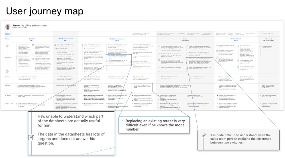
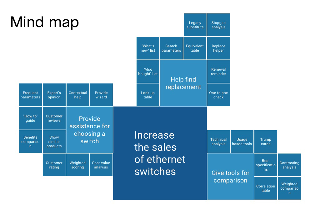
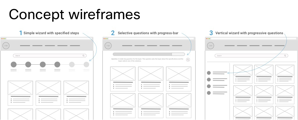
Once I had a list of pain-points identified from the previous exercise, I decided to brainstorm with the users, SMEs, stakeholders and team members to solve the problems. Some of the suggestions from the customers were also thrown in. My objective was to get as many creative, yet functional ideas as possible.

Challenges:
Getting in the creative ideas and documenting them is important. Next step was to pick up the ideas that worked best for us. With the limited time, I needed to see how important each idea was and how difficult it was to implement.

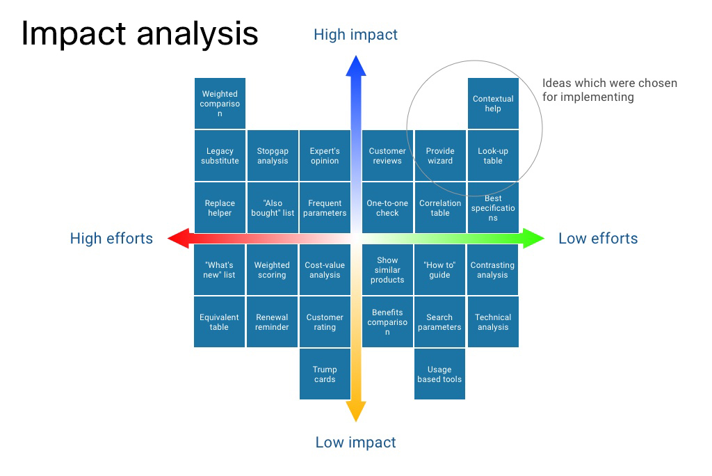
Solution: Impact analysis 
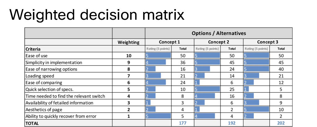
I created an effort-impact analysis chart, which enabled us to estimate how impactful an idea was versus how much efforts were needed to develop it. 

The mind-map helped in documenting the ideas and generate more branched ones.


Ideas which created high impact and were easy to implement were chosen for the quick turnaround.

The top three ideas were:
1. Provide contextual help for guiding the users with the terms used.
2. A look-up table which will allow the users to quickly find a replacement.
3. A wizard to gently guide the user based on the questions asked.


Testing the concepts

Creating and picking the best solution

A number of solutions were generated, however I had to decide which one was to be implemented. 

Challenges:
1. Converting the statements into technical solutions
2. Finding out the criteria to evaluate the concepts 

Solution:
I created wireframes and presented it to the users. Based on their’s and the development team’s feedback, I created a weighted decision matrix to reach the perfect solution.

Three concepts for the solution

Which solution is the best for the users? The one with most points!

Using weighted decision matrix, each concept was given a rating by the users (data imaginary) This was discussed with stakeholders and the development team.
This shows that Concept 3 – vertical wizard with progressive questions is a winner.


detailing out the solution

Taking the concept to full featured page

The chosen solution needed to be translated into a feature-rich design. I created an initial wireframe and perfected it with feedback from users and stakeholders.

The wireframe with all features was presented to the users for getting their inputs

The final wireframe which captures all the features. Some minor details were updated after the feedback.
It was designed to align with Cisco design guide.


challenges in implementation by dev team

Looking at the animation, the developers found it difficult to build the page!

First impression matters. I wanted to get the loading experience of the page to be perfect! 

Challenges:
1. Creating a
great experience while the user waits for page to load.
2. Communicating the experience to the
developers so that they can create the page. Originally the developers could not understand how to get the animation right.

Solution: Header loaded in sequence

Final load animation: The animated hero image on loading and the way in which the side buttons sweep out was loved by the stakeholders! View here ➜


I used Adobe After Effects to get the experience right. I played around with timings and animations which could be later communicated with the developers.


Asking the questions selectively for wizard 

Solving the first problem, “I want help in selecting a switch”

The users should guided to the right ethernet switches. 

Challenges:
1. Asking the users the questions in
correct order.
2. Making sure that the questions were not full of jargon.
3. If jargon could not be avoided, providing the guidance.

Solution:
I created a question map to see which question would come after which one.
And the results are filtered according to the answers.

The results unfolds as the user answers the questions.

Question map shows how the user is guided using the questions. View here ➜


Oh no! A requirement change! 

Marketing wanted to recommend the best switch to users!

While about 75% work was done, the head of the marketing came up with a great idea of recommending some popular switches to the users.

I wondered, “How would users feel about it?”.
Therefore, I did a quick round of A/B Testing with the selected users to figure out if this really was the case. And it turned out that users were actually liking it. Though they needed to know why it was the best switch for them.

To keep the process simple, I designed a simple star and a non-jargon explanation to why we recommend it.

Users love to be explained which solution is best for them in simple terms


Comparing the switches

Solving the second problem, “I want to compare the switches”

The second pain point that the users faced was comparing the switches.

Solution:
I created a simple way to select the ethernet switches and allowing them to be compared.
Further the language was kept easy to understand.

Comparing helps make an informed buying decision. View here ➜


Upgrading the switch

Solving the third problem, “I want to see the upgrade options” and the look-up table

The third pain point that the users faced was searching the upgrades to an existing switch.

Solution:
Based on the impact analysis, I detailed out the idea of a look-up table.

The results unfolds as the user answers the questions. View here ➜


Results: Sales are up!

Selector helped increase the sales a lot!

The switch selector improved the sales of ethernet switches a great deal! And it was celebrated as one of the most profitable projects at Cisco.

Several sites on the internet covered this success to a great extent.


Spin off: Router selector

After the phenomenal success of Switch Selector, we designed Router selector!

The Router Selector which was a spin off from this project. View here ➜


If there’s something that could’ve been better…

Post-release musings…

If you ask me if I had to do this again, then I’ll say …


1.
Exploring more options: While the present design is great, we really didn’t try out too many alternatives. 


2.
More usability testing: I feel that we could have done even a better job with more usability testing, with more concepts.

3. There is still a lot of jargon: I was never able to simplify all of the jargons or help the users find their meanings. Perhaps, there is an opportunity to educate the users.

4. Optimizing for slow internet: The current implementation demands a lots of bandwidth. Perhaps we can give the users a choice to load a lighter version of the app.