How I helped Indian retailers calculate taxes quickly!

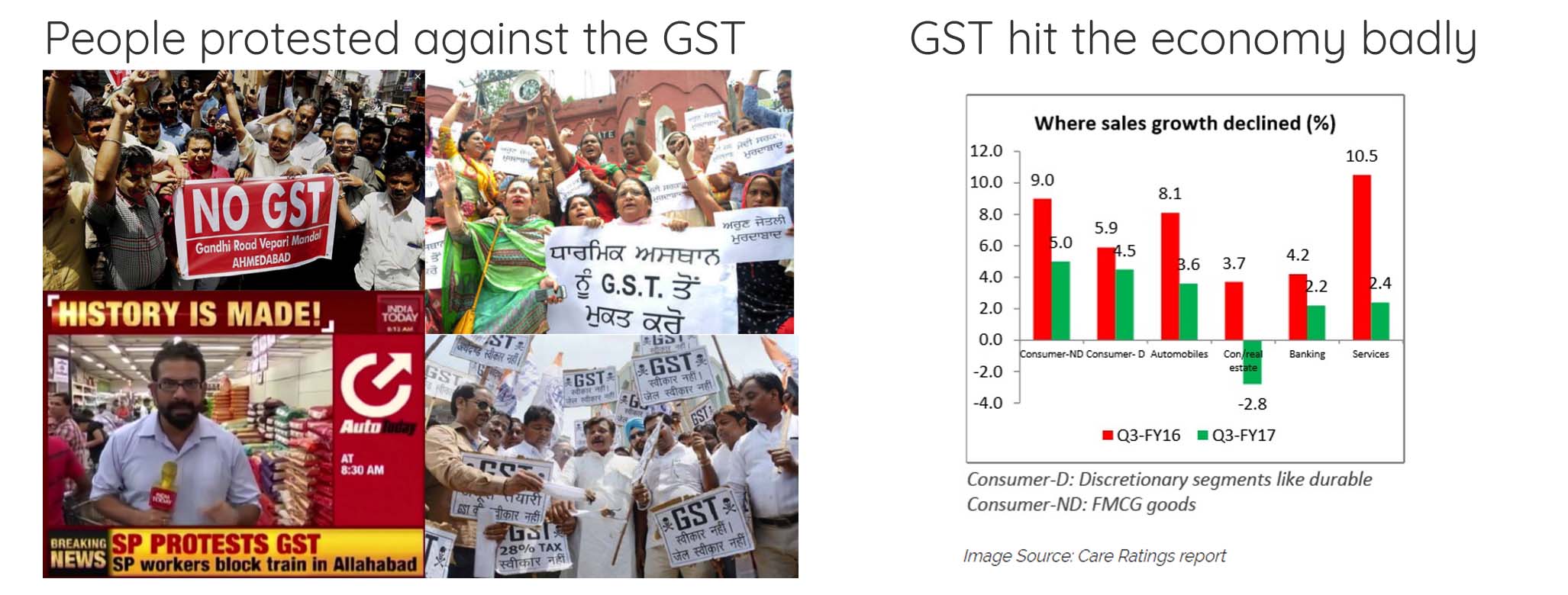
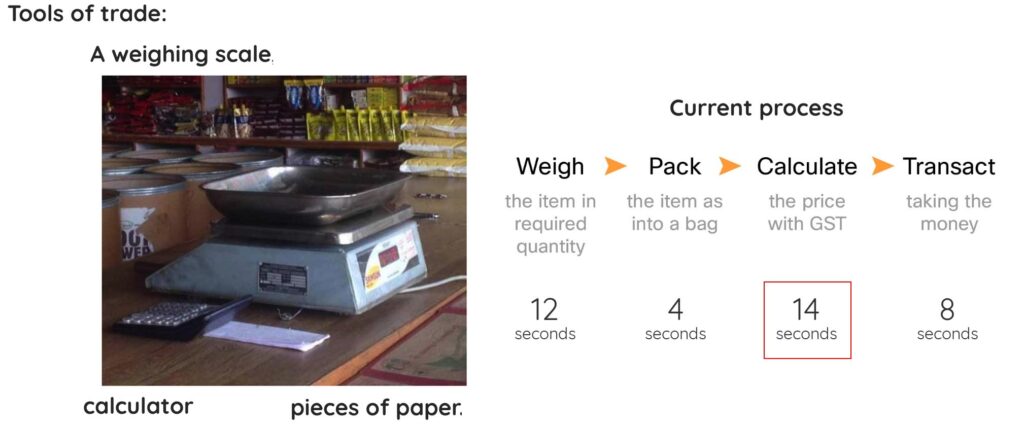
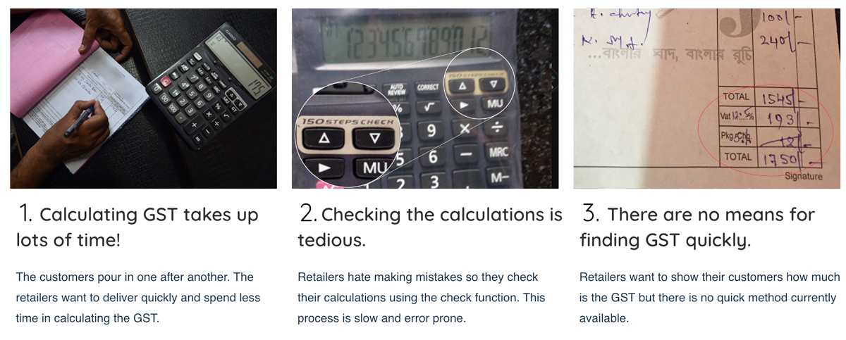
Introduction of the new GST system in India caused lots of problems. 
There were more questions than answers! 

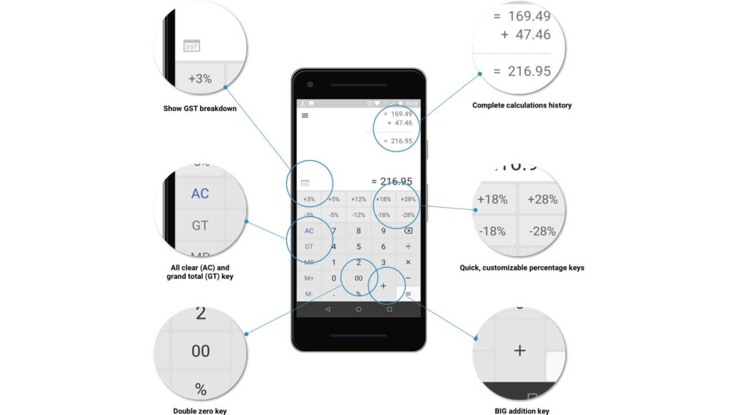
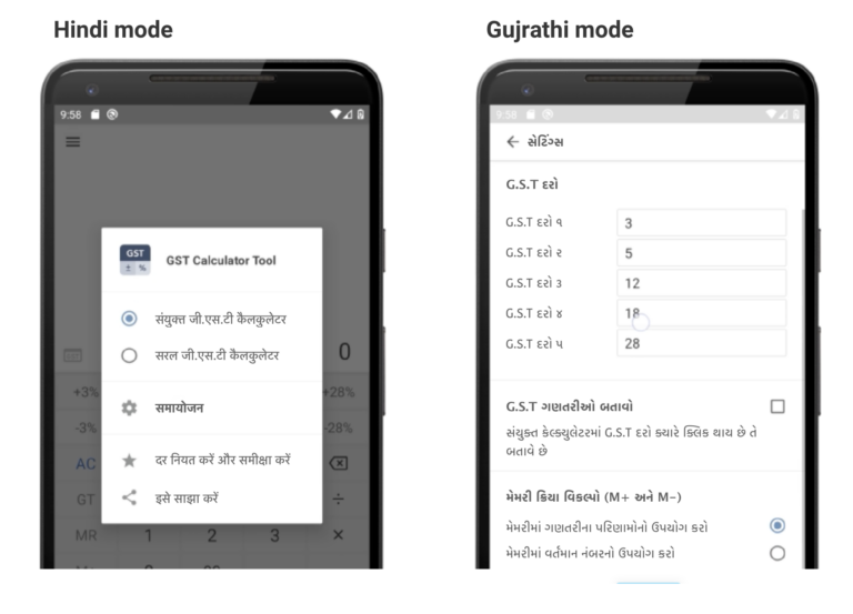
In 2018, I convinced ZoomTook, an app company, to make this task easy by introducing an easy-to-use GST (Goods and Services Tax) calculator. 

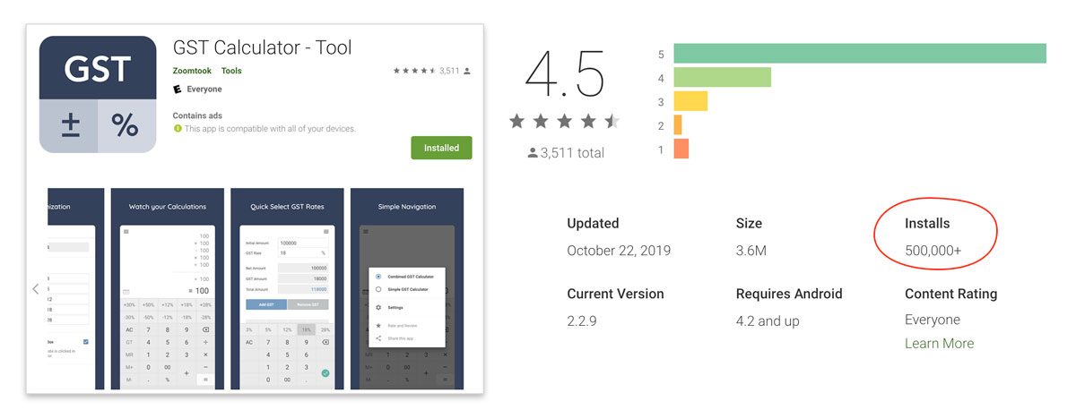
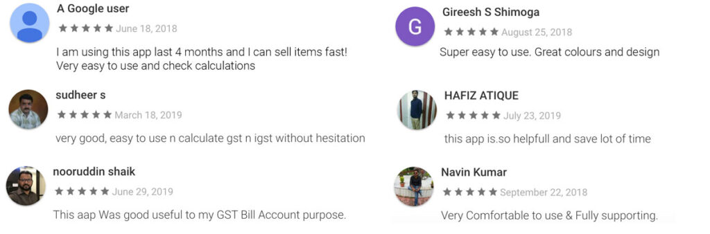
I worked as a UX designer for this project. This resulted in an app which was downloaded more than 100,000 times in first month and had a consistent rating of 4.5 stars on Google Play store!

Get it on Google Play

Note: Because of the non-disclosure agreement, some of the information on this page has been replaced with fictitious ones or has been blurred out.in 


Situation: New GST law in India! 

The new GST law was introduced and it was very confusing!

In 2017 Government of India initiated a new type of tax called GST (Goods and Services Tax). This created a huge uproar in India because everyone was confused over how it will help over a long run. 

The retailers were hit the worse because of the new GST laws


The target group: Small retailers

The government introduced a very complicated tax structure!

Basic items (e.g.milk and eggs)
0 %
Mass items (e.g.skimmed milk powder)
1 %
Processed items (e.g.cheese and spreads)
1 %
Consumer items (e.g. toaster, phones, etc.)
1 %
Luxury items (e.g. watches, perfumes, etc.)
1 %

Retailers have to calculate separate GST for each item.
The GST on each item varies, so the retailers have to remember and calculate a different percent on each item before billing. Most shops still calculate the GST using calculator and paper.


The solution — downloaded 500,000 times!

An app that helps the retailers with GST!

Just-1-tap solution to calculating GST!

Objective:  At the inception of this app my user research at ZoomTook found out that there was no app in the market which allowed the retailers to calculate the GST.

Challenge: For the selected target audience there was no user data available and there was no clear design direction either.  

Solution and execution: The client hired me as a freelance designer. I recognized the need of the users, provided design strategy and executed the end-to-end design.


HOW WAS THIS ACHIEVED?

I was the UX designer at ZoomTook and this is what I did there

Securing funding for user research from the business

Convincing the business for a simple GST calculator

Co-ordinating for high quality experience

Launch and Success!


what I did…

I was only expected to implement the design they created, with both UX and visual design.
I ended up doing MUCH more!

UX research

I conducted the background investigation to find out what problems the users are facing and how can we best solve them.

Strategy

I presented the stakeholders with my ideas and helped them make decisions for better profits.

Planning and designing

I planned all the design activities and built the design grounds-up. I negotiated with the stakeholders to create the best user experience.

Usability testing

I refined the designs to make sure that they were user-friendly. For this I ran several rounds of moderated and unmoderated usability and experience feedback sessions.


 The (lack of) Vision

The stakeholders already had a design which I was to ‘beautify’!

Reconstruction of the idea stakeholders had in mind


What success looks like?

I defined what success looks like and presented this vision

The business team had originally only thought about launching a simple calculator app in already an overcrowded market. 

I needed to balance the insights from the user research with the success factors for the business. For example, placing ads in the app spoils the experience , however it is must for the business to earn money. 

I spoke to the marketing team and business. I understood how they intend to earn money from this app. If we achieved these 5 items within the given time frame, we would consider the app to be successful.

The five success factors (much beyond what was originally planned!) :

100,000 downloads in first 6 months

10% users retain the app for 3 months

4.0 rating on Google Play Store

Daily usage for 30 days

5 active sessions after install


 Convincing the clients for UX research

Client was very reluctant for spending time on UX research. They wanted to launch the app ASAP!

The clients felt the user research was waste of time and money. They wanted to start with the design right away. However I needed to convince them to allocate time and funds towards user research.

This was challenging as the client wanted to launch the app early and make money.

I showed the client how the returns would be better in the long term with an investment in user research.

Result: Funding approved!
I was able to prove to the clients how important it was to improve the user experience since it has direct impact on the business. They allowed extra funding and design time for obtaining insights from users. This helped me to create a better experience for the users and improved returns for the business.


 Way Forward: Lean UX

With the limited time and budget for research, I chose to go ‘lean’ 

Example of hypothesis that was used for carrying out user research

I was only able to get 5 days for research.

I formulated the multiple hypotheses and tested them out.


 Phase 1: Initial user research

Setting up clear goals for the user experience

I wanted to gain insight into how the sellers currently calculated the percentage of taxes and discounts. This would help my design decisions and make the app more relevant and useful for the retailers.

This task was difficult because I would need to spend time observing and interviewing the retailers in their own shop during their busy schedules! 

I decided to understand the role that the app would fulfil in the daily activities of the retailers. I spoke with 12 sellers to understand their behaviour. 

A typical small shop: several items are packed on spot.
GST for each item varies. The shopkeeper calculates the selling price on spot and adds it using a calculator.


 Initial observationS

Understanding where retailers needed help
Time-task analysis

The crux: Selling loose goods takes time!
Weight for each item varies and hence GST as well.
The shopkeeper calculates the selling price on spot and adds it using a calculator.


 Challenging the clients’ design

Advocating better business solution through user research

I presented the return on investment (RoI) of building the better design based on my initial user research.
Looking at the revenues, the client decided to go with building the GST app.


 phase 2: DEtailed Observations

What I observed and noted in field

Observations: 

The typical user of the app is a keeper of a small shop. He has a shop full of fast moving items. Many of the items are pre-packaged. However other items would be weighed, adjusted and packed on spot as per the wishes of the customer. For such items he would calculate the tax on spot.

The retailers sell loose items by weight.
Hence they have to calculate GST for each item.

The observation tree approach

The observations are recorded in the form of a series of words and phrases to signify what is important for the retailers and shopkeepers. The observation tree helped maintain focus on the each step in process.


 Synthesis of findings

Arranging notes in a meaningful way

The raw notes and method for arranging the field notes
I recorded the observations on the sticky notes and stacked them according to recurring topics.


Affinity mapping


 Pain points

Field observations of what hurts the retailers the most!


 solution ① Speeding up the calculation process!

Addressing pain point #1: Calculating the GST takes up lots of time!

 GST percentage buttons
The fixed GST keys are provide one-tap solution to calculating a GST.
Change the GST percentages?    Go to Settings then Percentages


 SOLUTION ② Calculations history!

Addressing pain point #2: Checking the calculations is tedious!

Inspiration: Adding machine. iStockPhoto

Root cause
The retailers might lose customer and money if there is any mistake in the calculations. Presently they use the repeat function to check calculations. This is error prone and tedious.

Inspiration
I was inspired by the printing adding machines which printed out a strip to check calculations.

 Retailer can view all the history of calculations
This is much elegant and visual way of checking without tapping any more keys.


 SOLUTION ③ Getting the cost breakdown!

Addressing pain point #3: Showing the cost breakup quickly to customers

 Retailer can see the breakdown of GST and copy and share it too.


 getting it together: Building the structure!

Bringing the solutions together

I needed to systematically include all the major ideas into my design, so I needed to break down the system into a function structure diagram. I used the method described in Engineering Design: A Systematic Approach [Gerhard Pahl, W. Beitz, et al

Function structure diagram: 
The diagram allowed me to place each feature in the app in logical fashion.


 Testing out the initial designs

Creating and perfecting the design through user feedback.

I needed to ensure that the structure and design were really solving the right problems. Hence I needed a feedback from the users.

I decided to go to users with the set of wireframes. This time I chose a mix of users: 4 were completely new while 2 were from original testing. I planned the set of tasks and laid down a few ground rules, such as ‘speak your mind out continually’. 


 TURNING THE  usability learning INTO EXPERIENCE

How the voice of users was transformed into a delightful experience for them

I always found designing from feedback to be challenging. Hence I prioritized the feedback from users and my own observations and then derived the features that addressed them. This allowed me to present a clear customer-driven design process to the stakeholders.

Customer-driven design process
Diagrams like these allowed me to capture the design decisions and reinforce how customer played an important role in the design process.


Getting the flow right

Presenting a logical flow functions so that the user can seamlessly navigate the app.

The flow diagram
The flow diagram shows how the user would navigate in the app. Essentially this helped me capture the what-comes-after-what in the entire process.
This also helped me communicate better with the devs.


 THE VISUAL APPEAL

Creating a visual delight through style guide

One thing that made this app appealing was it’s look. I worked on the design language and the style guide to keep a consistent pattern and good looks throughout the work. 

The style-guide
I used corporate colours and defined each element carefully so that the app looked cohesive and consistent throughout. 


 Capturing all the features

How all the features look on a screen (they do follow function-structure laid earlier)

The features
I designed the calculator which would solve all the painpoints in one screen.


 Customization, Inclusion and diversity

The retailers can customize the colours of the calculator… even helps visually impaired
using the accessibility guidelines

The customizable but inclusive colours
In order to address accessibility and make the app more personalized, users can choose the colours of their choice for various elements of the app. 
This was done using WebAIM tool

Contrast checking using the 'Medium contrast theme' WebAIM tool


DIVERSITY

Giving the users interface in their own language!

Celebrating diversity in languages
Keeping diversity of users in mind, they feel more comfortable using the interface in their own language.


 Design of interactions

The design interactions were communicated to developers using mockups

Swiping between the regular and focused GST calculator

Design interactions for focused calculator


 logo for free…?

Though logo was not the part of original brief, I wanted to create one for better experience

Logo speaks volumes about the app. It’s the first interaction point and getting it right could mean more downloads. The stakeholders set a very simple brief for this.
The brief:
1. Should show it’s a GST calculator.
2. Should use the brand colours.

It was presented to a group of users for voting on which one they most related to.


 Launch and response

The app was finally launched in August 2018

Measuring success of the app against the target

Target

100,000 downloads in first 6 months

10% users retain app for 3 months

4.0 rating on Google Play Store

Daily usage for 30 days

5 active sessions after install

Actual

✅ 100,000 downloads in first month!

✅ More than 50% users are still using the app

✅ 4.5 rating on Google Play Store

✅ 60 days of average daily usage

✅ 20 active sessions on an average

The success story
With a rating of 4.5 and half a million download, the success speaks for iteself!

… and the users are happy!
Some reviews from Google Play store.


 physical calculator v/s GST app

I went about asking about the physical calculator (earlier solution) with the app we created

  • Owners of high-end shops use the app since they do a lots of sharing over Whatsapp and email.

  • Suggested the client to create a physical version of the app.

  • About half of the users still prefer a dedicated calculator because phones are expensive and get engaged if there is a call.