Easily calculate taxes on your goods!

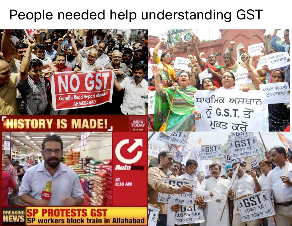
Introduction of the new GST system took India by a storm. 
There were more questions than answers! 
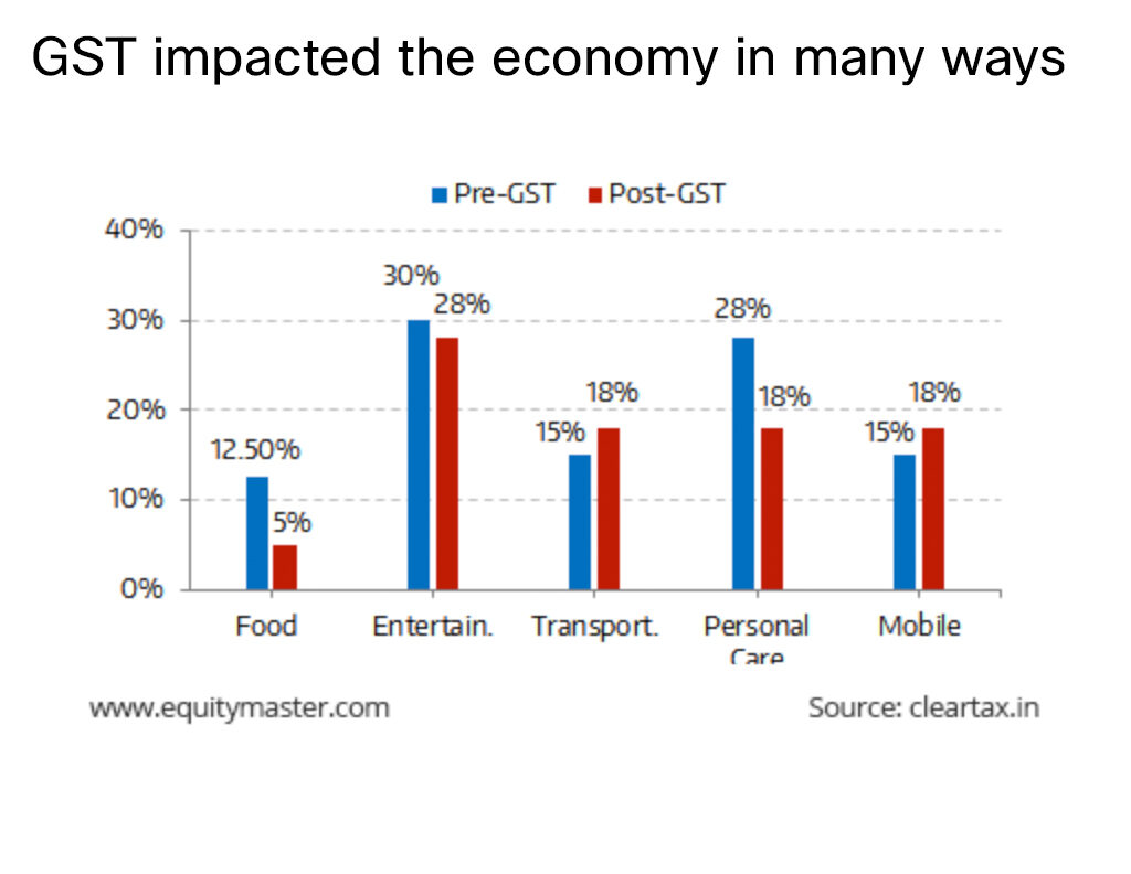
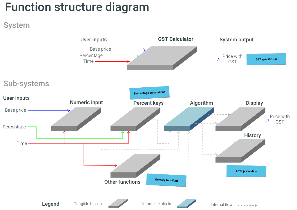
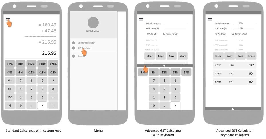
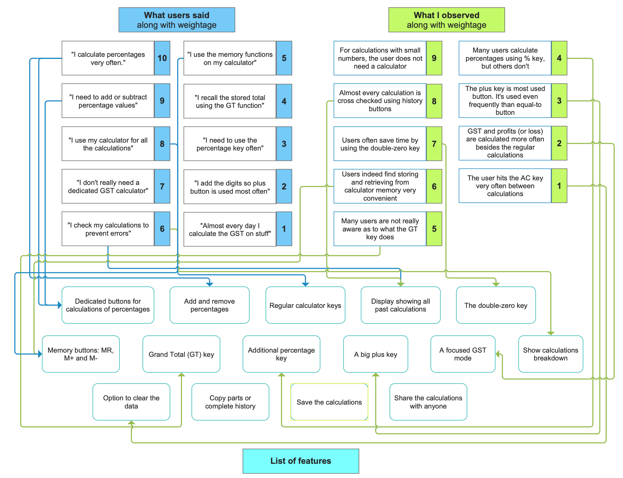
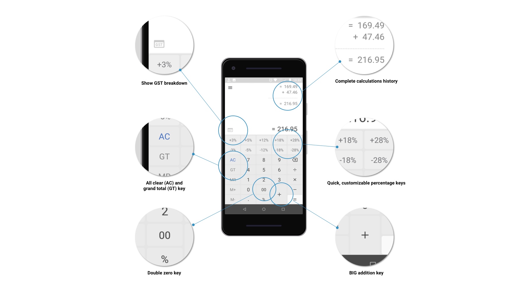
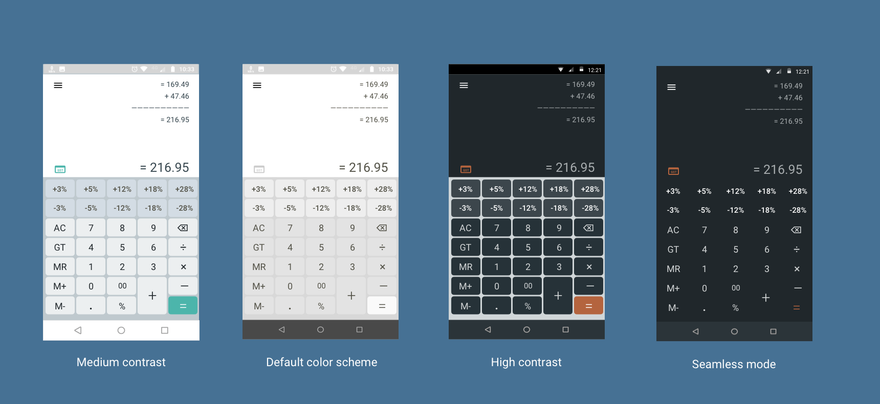
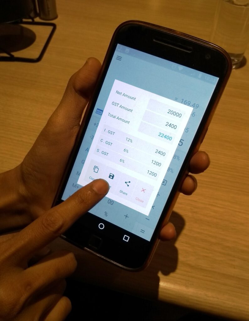
In 2018, ​ZoomTook, an app company, decided to make this task easy by designing an easy-to-use GST (Goods and Services Tax) calculator. 

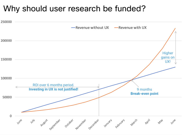
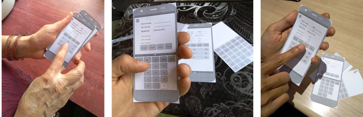
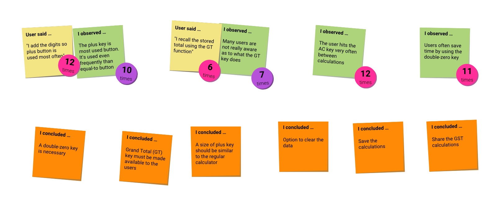
I worked as a UX designer for this project. This resulted in an app which was downloaded more than 100,000 times in first month and had a consistent rating of 4.5 stars on Google Play store!

Get it on Google Play

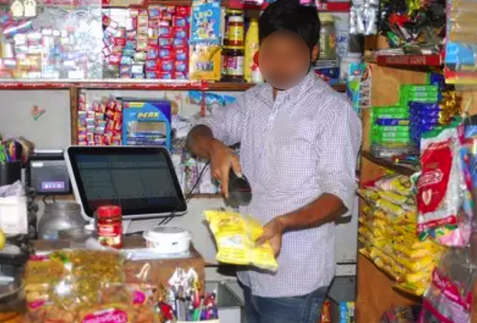
Note: Because of the non-disclosure agreement, some of the information on this page has been replaced with fictitious ones or has been blurred out.

conclusion


New GST law in India! 

The new GST law left everyone confused and angry!

The government of India initiated a new type of tax called GST (Goods and Services Tax). This created a huge uproar in India because everyone was confused over how it will help over a long run. 


ZoomTook to rescue!

ZoomTook decides to build an app to help people with GST!

Objective: 
At the inception of this app the marketing team at ZoomTook found out that there was no app in the market which allowed the retailers to calculate the GST.

Challenge:
For the selected target audience there was no user data available and there was no clear design direction either.  

Solution and execution:
The client hired me as a freelance designer who would own the responsibility for understanding the need of the users, provide design strategy and execute the end-to-end design.


My role: UX designer

UX research

I conducted the background investigation to find out what problems the users are facing and how can we best solve them.

Strategy

I presented the stakeholders with my ideas and helped them make decisions for better profits.

Planning and designing

I planned all the design activities and built the design grounds-up. I negotiated with the stakeholders to create the best user experience.

Usability testing

I refined the designs to make sure that they were user-friendly. For this I ran several rounds of moderated and unmoderated usability and experience feedback sessions.


What success looks like?

Defining the 5 criteria to measure the success of the app!

Objective: 
I decided to define what are the parameters would mark the app as successful?

Challenge
I needed to balance the insights from the user research with the success factors for the business. For example, placing ads in the app spoils the experience , however it is must for the business to earn money.

Process: 
I spoke to the marketing team and business. From them I understood how they intend to earn money from this app. My aim was to balance an excellent user experience and the demand for the app to be successful. If we achieved these 5 items within the given time frame, we would consider the app to be successful .

The five success factors:

5 active sessions after install

Daily usage for 30 days

100,000 downloads in first 6 months

4.0 rating on Google Play Store

10% users retain the app for 3 months


The audience

Who would be the intended users of this app?

Primary user: Retailer 
Retailer is a person/business who sells goods directly to consumers for consumption, rather than for resell.

Secondary user: Anyone who wants to calculate percentages
This app calculates pre-fixed percentages quickly so it can be used to calculate tips on bills for example.

Distribution of the user groups:


 Convincing the clients 

How I convinced the clients to give funds for user research

Objective
The clients felt the user research was waste of time and money. They wanted to start with the design right away. However I needed to convince them to allocate time and funds towards user research.

Challenge
Convincing the client the need for user research was difficult one because they were more focused on making money using the app. 

Solution
I showed the client how the returns would be better in the long term with an investment in user research.

Result: Funding approved!
I was able to prove to the clients how important it was to improve the user experience since it has direct impact on the business. They allowed extra funding and design time for obtaining insights from users. This helped me to create a better experience for the users and improved returns for the business.


 Initial user research

Setting up clear goals for the user experience

Objective: 
I wanted to gain insight into how the sellers currently calculated the percentage of taxes and discounts. This would help my design decisions and make the app more relevant and useful for the sellers.

Challenge: 
I needed to collect data from the correct set of users. 

Solution and execution:
I decided to understand the role that the app would fulfil in the daily activities of the sellers. I spoke with 12 sellers to understand their behaviour. 

Respondents
1
Questions
1
Response rate
1 %
Insights
1

Quantitative results:

Each seller calculated percentages 5 times a day

80% of the sellers used app or a software to calculate percentages.

They used it at least for 1 month before discontinuing it.


What does a day in life of a retailer look like?

Digging deeper into the user research to gain better insights

Objective: 

The initial research did uncovered about the current situation. One of the most important insight I wanted to derive was what would the sellers like to see in the new app that we were developing.

Challenge: 
I needed to use the correct research methodology so that I can identify the raw data correctly.

Solution and execution:
After gathering the initial understanding, I could dig deeper by observing rather than talking. I decided to observe the shopkeepers and retailers in their day to day activity and how they went about it. For doing this, I sought the permission from 5 shops to understand how they worked and carried out the calculations. 

A keeper of small shop attending his customers. Notice some of the open bags which contain items that would be weighed and sold as per customer's request.

Observations: 

The typical user of the app is a keeper of a small shop. He has a shop full of fast moving items. Many of the items are pre-packaged. However other items would be weighed, adjusted and packed on spot as per the wishes of the customer. For such items he would calculate the tax on spot.

The observations are recorded in the form of a series of words and phrases to signify what is important for the retailers and shopkeepers .

Insights: 
The raw data was synthesized to find recurrent patterns. Using this deeper insight was derived.

Technology

Only a few shopkeepers have barcode scanner. Even with that, the items are packed on-spot, weighed and given to customers. Hence GST needs to be calculated on spot for each item.

Existing usage

The shopkeepers hate to make a mistake! So they use the replay button to recheck their calculations. There is a great demand for calculators with such options.

Smart phones

All of the shopkeepers own a smartphone and are expert in using it. They prefer to have large screen ones.

Time is everything!

At a typical shop, the customers pour in one after another. The users want to calculate the results as quickly as possible and attend the next customer.

Conclusion
I had a set of observations from my visits along with interview notes. I grouped them together to find the common patterns. From this I derived the features that would go into the app.

Grouping the observations and interview notes under common themes.


Casting ideas to  design

The ideas need to be given a tangible form

Method: 
I needed to systematically include all the major ideas into my design, so I needed to break down the system into a function structure diagram. I used the method described in Engineering Design: A Systematic Approach [Gerhard Pahl, W. Beitz, J. Feldhusen, K. H. Grote, Ken Wallace, Lucienne T.M. Blessing] 

Function structure diagram: 
The diagram allowed me to find how each observation was implemented .


 Wireframes and initial feedback 

Creating and perfecting the design through user feedback

Objective: 

After designing the wireframes, it was important to test if the design agreed with the users. 

Challenge: 
1. To make sure that the users understood what I was looking for.
2. To get the users tell their genuine thoughts about the product.
3. Assessing the changes to make the product more usable.

Solution:
I decided to go to users with the set of wireframes. This time I chose a mix of users: 4 were completely new while 2 were from original testing. I planned the set of tasks and laid down a few ground rules, such as ‘speak your mind out continually’. 

Initial wireframes for testing.

Pilot run:
Initially I was not sure on which media to use.
Option 1: To use a virtual mock-up like shown below
Option 2: To print out the wireframes on the cards and simulate the user flow.

“Soft” prototype that was tested for the pilot run with the users.

Pilot run results: 

The pilot testing indicated that many users felt it difficult to relate with the digital mock-up. I observed that they were expecting an actual app to run on the mobile phone, not a greyscale mock-up! 

Actual testing session: 
The actual testing was carried out with simple paper wireframes. 
The users were given a set of tasks beginning with simple and then going through more difficult ones.
The results were surprising as the users gave very good suggestions on what they liked and what they wanted to be improved. 

Results: 

The users gave valuable feedback which went to improve the design to a great extent. The feedback was captured and ranked, and action items were created. 

New findings!
I came to know a number of things which were missed in the previous iteration. I listed them down in the form of sticky notes.

New observations and findings


 Turning the  findings into experience

How the voice of users was transformed into a delightful experience for them

Objective: 

Now that I had all the necessary insights from the users, it was time to translate them into something that will delight them.

Challenge: 
1. Breaking the feedback into categories and processing each one.
2. Ensuring that the each point in feedback is converted into a feature.
3. Conversely, ensuring that the features solve the pain points of the users.

Solution:
I first rated the observations and then gave them a weightage. Then I found solutions to each one of the need and created a feature that will solve the problem.

Deriving features from the observations.


 Arranging the information

Presenting a logical flow functions so that the user can seamlessly navigate the app.

Objective: 

I needed to arrange the functions in a logical manner, one after another so that the user can do exactly what they need to do without thinking much.

Challenge: 
1. Deciding which function to place where.
2. Arranging the functions so that on each page user is presented with correct set of options relevant for the task at hand.
3. Presenting the arrangement to the development team so that they can develop the application easily.

Solution:
I first created the blocks of information and arranged the functions within it in a logical manner. Then I decided which interactions are to be provided to invoke these features. I had several rounds of this with both the stakeholders and users. The flow diagram was finalized and development team was briefed so that they can prepare accordingly.


 Designing the Logo!

Logo design should begin as the face of the app

Objective: 

The objective of the logo is to present the app and its function in a visually appealing way. 

Challenge: 
Initially I was not assigned to design a logo, but it became clear that the app needed one and there was only designer on the team!
1. The logo needed to be used all across the places such as the launcher in Android, Google Play Store, the company website and other promotional material, if the company would create it. Therefore, it should be simple yet easy to reproduce.
2. The logo should be easily recognized and it should represent what this app did.

Solution:
I sketched out many ideas for the logo and detailed out some of these. Then I presented the shortlisted ideas to the stakeholders for getting a consensus on which one to finalize. After a few iterations the current logo was decided to be used across the board. 

Concept 7 was finalized because it clearly presented the three major functions of this app: 
1. It calculates the GST
2. It can add or remove
3. It can work out percentages really fast.

The other concepts were dismissed since they were deemed too complex or did not hold as much appeal as the others.

The logo in full colour, greyscale and in black & white, for use on different media


 The visual appeal

Creating a visual delight!

Objective: 

The app should be consistent in look and feel. 

Challenge: 
1. Creating a design language.
2. Designing the screens that are visually appealing.

Solution:
I created the design language and designed the screens according to the style guide for consistency.

Creating a styleguide for consistency

How style guide was created: 

The style guide represents the brand image and communicates the look and feel consistently. 

Colours: 
Navy-blue as the primary colour because it represented a serious tone and professional image.
Light blue as secondary because it was a tint of the primary colour and could be quickly identified with the primary.
Orange as accent colour because it created a contrast and gave a quick visual identification of the actionable items.

Fonts:
All the application is made in Roboto font as it’s the default font used on Android. 

Typography
The entire typography revolves around the Roboto font family and the fonts and their usage is clearly defined with sample texts. 

Icons
Since this application is not heavy on icons, it was decided that default Android icon set would be sufficient.

Capturing all the features visually

Various modes are available for the display. Even accessibility has been taken into account while designing some of the modes.


 Designing the interactions

Detailing out the final bits of experience 

Objective: 

I wanted to give the user a great experience in every small interaction they had with the app, hence I needed to manage each detail with great thought. 

Challenges: 
It is difficult to communicate the details of interactions and animations to the developers. Moreover, getting each and every detail right is challenging even using advanced prototyping tools.

Solution: 
In the initial stages, I communicated the interactions using notes added to the design files. In the later stages, I sat along side the developers when the code was almost ready to fine tune each animation.

Entering and calculating the GST is an automatic process which does not need an ‘equal to’ button. To proceed to next line, a arrow key is provided.

Small interactions, like this animation which the user sees while setting the GST rates, require a good deal of communication with the developers.


 Launch and the response

This is how much  people loved this app!

In 2019, the app went live and just within the first 2 months of it’s launch, it crossed 100,000 downloads!

Get it on Google Play

What people say?

it's really good and very helpful to calculate anything about GST or without GST.
Niraj Dave
This app is really very well designed and easy to use. I replaced my calculator with it!
Ramesh Varmora

How did it fare against the business metrics?

5 active sessions after install

Achieved more than 10 active sessions per user!​

Daily usage for 30 days

90% users used this app longer than 30 days!

100,000 downloads in first 6 months

100,000 downloads in just 2 months!

4.0 rating on Google Play Store

Rating of 4.5 on Google Play Store!

10% users retain the app for 3 months

Retention of more than 21% over the past 6 months!